

I had the opportunity to watch Colours of Time (2025), the French film about a modern extended family who inherit their ancestor’s house, intercut with the ancestor’s story — that of a young woman who moves from the country Paris in search of her mother in the 1890s — while in France this summer. And as I suspected when I wrote about costume designer Pierre-Yves Gayraud‘s work, the costumes were FABULOUS — but even more, this was a WONDERFUL movie in terms of total realization. It’s been released in the UK, although not in the US, so I highly recommend if you can access British or French streaming sites, you track this down. You’ll be SO glad you did!
Essentially, in France there are really complex laws about who inherits property after someone dies. Legally, ALL the children have to inherit and do so equally, so there are complicated cases where lawyers have to track down distant descendents to be able to settle an estate. In Colours of Time, this distant descendents thing is what has happened — dozens of family members who don’t actually know each inherit their grand-whatever’s home in rural Normandy. Four of them are chosen as family representatives to go explore the house and decide what to do with it, and when they visit, they realize there are several interesting aspects that need further exploration. As they do so, the four become family in a really real yet heartfelt way.
Meanwhile, the story is intercut with that of the ancestor — Adèle, who in 1895 left her home in the country for Paris. Her mother had left when she was a child, and although she sent money home, Adèle hadn’t seen her since she was a baby. Adèle wants to know why, and she also wants to know who her mother is. On her journey to Paris, she meets two young men and all three become friends, living at the same bar/lodging house in Montmartre.
Watching Adèle get to know her mother and developing her own sense of self is wonderful; what’s even better is this is one of the best depictions of turn-of-the-century working-class Paris I’ve ever seen on screen. Director Cédric Kaplash drew on the photos of Eugène Atget and others who documented the real, lived-in Paris of the period to create amazing sets and backgrounds that show a super realistic view of things like Montmartre’s windmills, a working-class bar, street scenes, and more. It was legit MAGICAL. There’s also some sub-plots that involve flashbacks to the 1870s and interactions with artists of the period, but I don’t want to give anything away. Just, GO SEE THIS IF/WHEN YOU CAN.


Looking at the costumes (the historical ones, as that’s our bailiwick here)… Director Kaplash told the Cannes Film Festival,
“I had never made a period drama before … Diving into the aesthetics was amazing but it required a large team and a lot of patience. I’d never worked this way before; working as you go along with a certain spontaneity. It was a pain-staking but rewarding process, which is ultimately the charm of the film” (Interview with Cédric Klapisch about La Venue de l’avenir [Colours of Time]).
The filmmakers were really trying for a realistic take on the historical costumes, which you KNOW I appreciated. Kaplash said in the press pack,
“When I make cinema, I always try to find a harmony between respecting realism (and the banality of everyday life) and creating a particular style unique to each film. If you’re too stylised, you become mannered and it very quickly becomes either too ‘commercial’ or too ‘fake.’ If you’re only respectful of reality, you risk being ugly or banal and missing a poetic dimension. What’s complicated is finding the right balance between the two. For me, Kubrick’s BARRY LYNDON, Pialat’s VAN GOGH, Patricia Mazuy’s THE KING’S DAUGHTERS and Jane Campion’s THE PIANO were guides to finding this delicate boundary. Conversely, there were also many bad examples that scared me quite a bit. There was a real fear of resembling bad historical TV reconstructions or American blockbusters that recreate an overly stylised idea of the era, far too removed from reality.”
While designer Gayraud said,
“I have a process that is always somewhat similar. First, a lot of immersion in photography. I have a lot of archives from the late 19th century. I’ve been collecting photo albums for about fifteen years and I manage to immerse myself completely in the era. Then I go to flea markets, where I try to create a small wardrobe for the characters, as one would shop today for a contemporary film. So I create an ideal wardrobe, trying to cover a bit of the entire spectrum of the society of the time we have to represent, and also to help the director immerse himself in that era… I try to create a kind of cloud from which we will draw elements. I like that we leave our first work session knowing exactly where we are going, rather than going through too many preliminary costume fittings in white fabric.”
Kaplash has a lot of praise for designer Gayraud:
“He has a very developed sense of colour, which for this film was essential. He also has an incredible feeling for materials and fabrics. Not to mention what I said about his knowhow in terms of manufacturing and organising work, and also his knowledge in documentation on this late 19th-century era. During the preparation, I was able to see the enormous collection of family photos he had gathered over the years, which allows him to di fferentiate between 1870 and 1890. He has an ultra-precise awareness of what a man’s shirt or a woman’s neckline were at that time, with all the associated accessories: cufflinks, ties, knots, collars. For women, it’s even more complex, with corsets, balloon sleeves, hats, etc. He also has a really technical knowledge of what making a period film entails. I had to work with people who had this very particular skill. Him and his entire team! Very quickly, you realise that for 100 extras, you need 10 people managing costumes, 10 people for hair, and the same for makeup. Initially, I had written scenes for 200 extras, but I quickly understood that we couldn’t do it within our budget. So the maximum we had was 70 or 80 extras in a scene, because it also takes about an hour to dress and style a person in a period costume. It’s an enormous job. These costumes bring a lot to the film.”
In terms of those extras, it was Gayraud who pointed out that fewer was preferable:
“It’s better to have 80 well-dressed extras filmed in detail, so you can go wherever you want with your camera. From experience, the poorly dressed extras are always the ones the camera ends up filming!”
Which, our “wtf happened with the extras” tag will demonstrate how VERY much that is true, so HALLELUJAH I say!
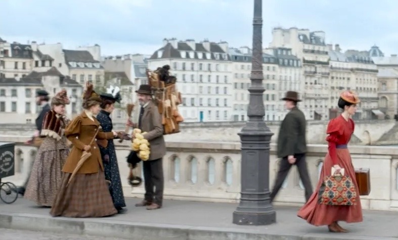
What’s interesting is that while Gayraud was focused on making realistic clothing, he also was aware of modern audience perceptions:
“I aimed to bring modernity to the period costumes, even though they are very period. That is, trying to find in the references things that could speak to today’s people. There was a desire to be very historical but to try to draw from the references, the photos, silhouettes, attitudes, and today’s physiques…”
Which is fascinating, because from my experience, when designers say they’re trying to consider a modern aesthetic they end up going all Da Vinci’s Demons/WTFrock. So here is proof that you can take that into account and still end up with costumes that look like what actual historical people were wearing:


The only section I wasn’t 100% thrilled with was the 1870s flashbacks, as I didn’t think the costumes were differentiated enough:


But otherwise, mad props, Colours of Time makers. MAD props!
Have you been able to track down Colours of Time? Who do we need to irritate to get it a US release??


This looks wonderful! My god, non-aristocrats had emotions and ambitions? Who knew? (I also like Adele’s brick-red dress.)
Yes! An excellent example of Not a Lady Doctor!
I usually like Cédric Klapisch’s films, but they’re usually contemporary (L’Auberge Espagnole trilogy, for example). It will be interesting to see him do historical scenes.
Oh interesting, I hadn’t realized he’d done those films! Yes, this is his first foray into historical and I hope he does more.
I saw the trailer and was intrigued. Glad to hear it’s wonderful. I’d love to see it.
From France .Lucky me. I liked this delightfull movie. Main actress is both ugly and charming. The sets are incredible ! Really nice, soft and funny too!