

Frock Flicks note: This is a guest post by Vincent Briggs, a part-time alterations tailor and part-time dinosaur cartoonist who is very fond of 18th-century menswear and has been sewing for over a decade. He can be found online here.
Hello again! I’m going to assume you’ve already read part 1, and get straight back to where I left off last time. A look at the masculine costumes in Our Flag Means Death (2022-), with a little bit of plot description. Part 1 was about episodes 1 to 5, and this post covers 6 to 10.
But first, an important update! I have been informed that Oluwande’s lovely little diamond-pattern knitted cap is based on an extant 17th-century one.


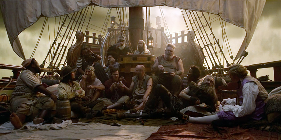
Episode 6 features a theatrical performance and some rather suggestive sword fighting.

A lot of stuff happens in this episode! There are a couple of very sweet scenes, and one where Izzy “only human in a Muppet movie” Hands gets a sandwich thrown at his head.
Stede starts off the episode in a beautiful satin waistcoat and breeches, which are probably purple but may be pink, it’s hard to tell in the dark. From what I can see, the waistcoat length looks 1760s-ish.

He wears the same outfit for a late-night fencing lesson, but without the waistcoat.
I talked about shirts in part 1, and how most of Stede’s shirts are pretty good, but I’d like to talk a bit more specifically about the front closures here. Nearly all of his shirts have this narrow little button placket down the front.

There’s a very anachronistic cravat covering most of it, but you can see that one of the top buttons is fastened.
I can understand why you’d want your characters to have the option to be varying amounts of buttoned-up, but I still wish we’d seen a few more proper 18th-century shirt fronts. An 18th century shirt typically fastens only at the collar with 2 or 3 buttons (though a ribbon through two buttonholes is also an option, and one I’d love to see on film) and then below the collar there’s just a hemmed slit with no closures at all. (Shirt buckles are an option, I suppose, but not super common, and it might be a bit odd to see one on an otherwise unbuttoned shirt.)

It’s a pretty long slit early in the 18th century and shorter by the end of the century, so in a show like this they could make it any length they wanted. To be fair, they do leave it as a slit without buttons on the ruffled shirts, including the one they both wore in episode 4, but not on any of the ones without ruffles down the front. The ones on the ruffled shirts are also very much on the short side, and early 18th-century shirt slits go a lot further down.
I think if Ed gets to wear crop-tops with a bit of tummy showing, Stede deserves to have a shirt or two with a historically accurate plunging neckline. If nowhere else, then at least for the flirty stabbing scene!
But the reason I really want more historical shirt slits is because of the little reinforcement patches. The slits down the front of the shirts are hemmed and need some sort of reinforcement at the bottom to keep them from ripping. Often it’s just some detached buttonhole stitch and a bar tack, but sometimes there’s a little heart-shaped piece of fabric sewn onto the inside!
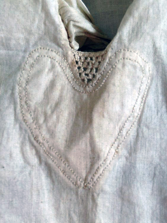
Being the same fabric as the rest of the shirt and sewn to the inside makes them a bit difficult to see, but this shirt and this shirt also have them. (These examples are all late 18th century, and I don’t know how early they started appearing, but for the purposes of this show it really doesn’t matter.)
Isn’t that cute? I think if you’re making a romance about 18th-century pirates, you should be required by law to have at least one such shirt reinforcement. Even if it doesn’t show up well on screen, it should be there. I want it. I want the cute little heart shaped shirt reinforcements. Please, someone put them in the show. Give us some cute shirt reinforcements in season 2. It wouldn’t take any extra time, you don’t need to hand sew them! You can hem the slit and sew the heart in by machine just fine, I’ve done it on my everyday shirts, you just need to hand-baste them first, and then you do a little bar tack by hand and it’s all set.
It’s delightful, it’s historical, it’s romantic, and it’d be a nice parallel to that heart appliqué on the flag in the last scene of episode 10. Put the little heart patches on the pirate shirts. Do it. Please.
Ok, back to the post.
The next scene is the last appearance of that yellow wrapper, and the first appearance of this very nice ruffled nightgown, worn with a nightcap which we also see in episode 4.
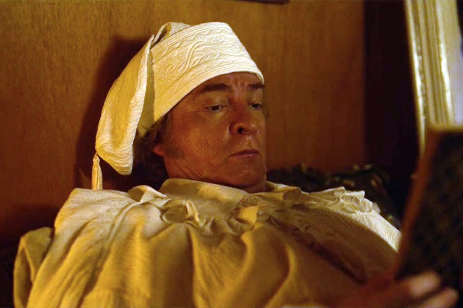
I’d taken it to be a cotton seersucker at first, but according to Hannah Greene’s Instagram post, it’s hammered silk. Not a very practical choice, as it wouldn’t hold up very well long term to 18th-century laundry practices, but we can’t question the logic too much on this show. I’m guessing it’s probably based on this extant cap and nightgown that sold at auction some years ago.

Just look at that cap, it’s almost exactly the same!

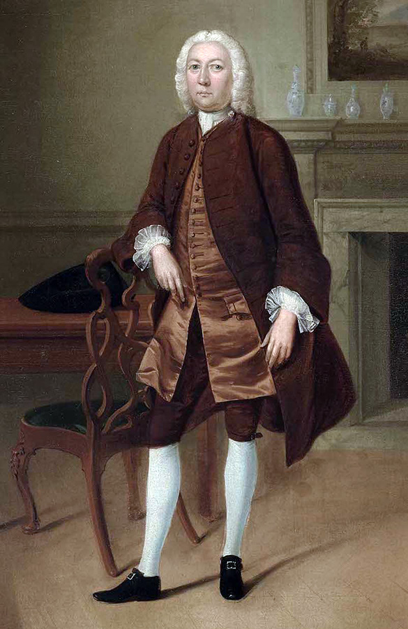
This pale pink and ivory-coloured suit gets only a few seconds of screentime, but the coat is lovely! It looks 1770s and pretty well cut. There appears to be a black cord couched around the edges as trim, which I like.

It reminds me a little bit of this listing from Kerry Taylor Auctions.

However, they’ve paired it with a more 1780s-ish looking waistcoat, and it’s really strange seeing a waistcoat with a collar being worn under a coat with none. This is a pretty frequent thing with Stede’s costumes — the waistcoats being a decade or several later than the coats — and it throws off the proportions and makes the suits not look as nice as they could. On some it doesn’t look too bad, but the drastically different necklines really do not work here!

It’s also got some similarities with early 19th-century waistcoats.
The buttons are inaccurate but pretty, the shirt cuff ruffles too long, and the breeches too loose, but these are more observations than complaints. As I said in the intro to part 1, I know they were working under extreme time and budget constraints and really really don’t want to be too harsh on the finishing. The neckwear isn’t 18th century at all, but I think I covered that thoroughly enough in part 1 too and don’t need to repeat it for every suit.
Stede’s drama teacher outfit is one we don’t get a very good look at, what with the dramatic lighting, but it consists of a modern black turtleneck sweater, a dark blue waist sash, an unusual pair of black breeches, black stockings, and modern ankle boots. The breeches have lacing at the knee instead of buttons, which is weird.

I like the blue sash and, much like the crew’s T-shirts, I think the turtleneck works here. Badly cut suits may annoy me, but modern knitwear in this particular context does not!
The crew of the Dutch ship they encounter are wearing 1630s–40s style lace collars and cuffs, which seems an odd choice. I know the 17th century was an especially good era for Dutch painting, but I think they should have been allowed to have 18th-century clothes.

Feeling like they’ve sailed in from another century does add to the spooky atmosphere though.
In episode 7, the ship runs out of oranges, and The Swede has scurvy so they really need to go ashore and get more. We get some backstory on the very secretive Jim, some romance between Jim and Oluwande, and meet Jim’s Nana (a nun who throws knives).
This is the episode where we first see the bird-printed velvet robe, which is easily the most iconic costume piece in the show. Showrunner David Jenkins said on Twitter that “The fuchsia floral robe was intended to highlight Stede’s confidence blossoming around Ed. Ed literally brought more colour into Stede’s life.” Aww!

Unlike the yellow wrapper he wears in earlier episodes, this one doesn’t have much in common with 18th-century ones, but it’s fabulous and I love it. And it fills the same sort of role in his wardrobe — a loose fitting robe to wear informally at home. It’s made of cotton velvet and lined with silk, has a big inverted box pleat in the back, kimono sleeves, and four long tassels.

A lot of people are making their own versions of this robe, including me. I want one! (I’ve made a wearable mock-up, drawn a rough pattern diagram, and listed some fabric sources in my blog post about it. In case anyone reading this also wants to make one.)
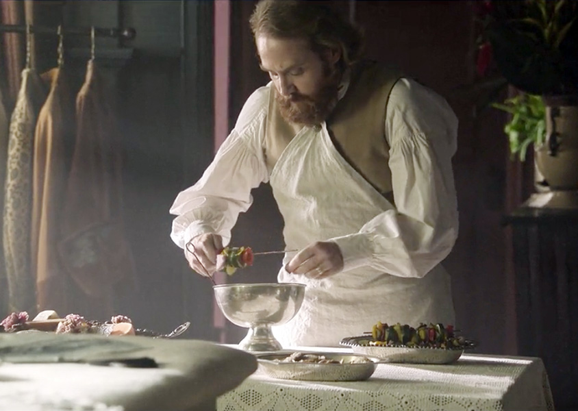
In the next scene, Stede wears a brown satin suit with a slightly darker brown textured waistcoat, and in terms of historical accuracy it’s probably his best one in the entire show. Not accurate to the 1710s, but very close for the 1740s.

It’s got cloth-covered buttons, and lots of them, hooray! The little stand collar is completely out of place for a coat that early, but otherwise? This is pretty nicely cut! It’s got great big cuffs and fairly tight sleeves with narrow shoulders, the fronts are curved and actually wide enough to button closed, and look at this!

Back panels the right width and shape, nice full pleated skirts, angled shoulder seams, and the pocket flaps are at the same level as the buttons over the back pleats! Everything that the blue episode 1 coat got wrong, this coat got right.
The breeches also look pretty decently fitted, and the waistcoat is an appropriate length for this style of coat! (Ok, it could stand to be a bit longer, but it’s fine it’s fine.) There are a few more things I could nitpick, but I’ve already talked about neckwear and shirt ruffles and construction deadlines and modern hair and such, so I’m just focusing on the suit itself. If this were in a Serious Historical Drama I probably wouldn’t be praising it quite so enthusiastically, but this is an 18th-century-ish fantasy world where crocs and cubist paintings and the book Pinocchio (1883) exist, so I’ll take what I can get, and I’m going to go ahead and declare this an excellent suit.
Stede buys a probably fake treasure map and takes Ed on a mostly fruitless treasure hunt, during which he wears this … Stede Irwin outfit.
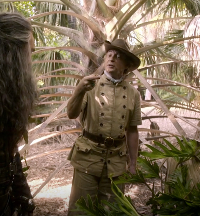
Adorable. I love it. I would wear it. It’s a perfect mixture of 18th century and modern! (Please note that when I say “modern” in reference to fashion history I’m including most of the 20th century in my definition.) I’d wager that the jacket was at least partly inspired by that leather hunting jacket from the KCI book.

They’ve made it in khaki-coloured cotton and given it modern short sleeves and some more buttons on the pocket flaps. I think the buttons are wood, but I would really like it if they were coconut shell.
Stede’s jacket appears to close edge to edge with hooks and eyes, but if you’re thinking of making one of these for yourself I’d highly recommend also making all the buttons functional, because one of the wonderful things about this kind of closure is its versatility. (Also, the V&A has a similar riding jacket, for anyone looking for a feminine version of it!)
You can button both flaps back and wear it open, overlap them all the way and have them completely closed, or unbutton just the top few so it flops down as a lapel.

Adding this to the list of things I want to make for my everyday wardrobe…
I’ve been fascinated by this particular style of waistcoat/jacket front for a long time, with the one row of buttons on the bottom and then two higher up, and have a section on one of my Pinterest boards for all the examples I’ve found. Some are very square like these ones, and some branch up smoothly in a beautiful Y shape. They vary a lot in width, height, and number of buttons, and cover quite a few decades. A lot of them are depicted in outdoor sporting scenes, so it makes sense to use this for a hiking outfit.
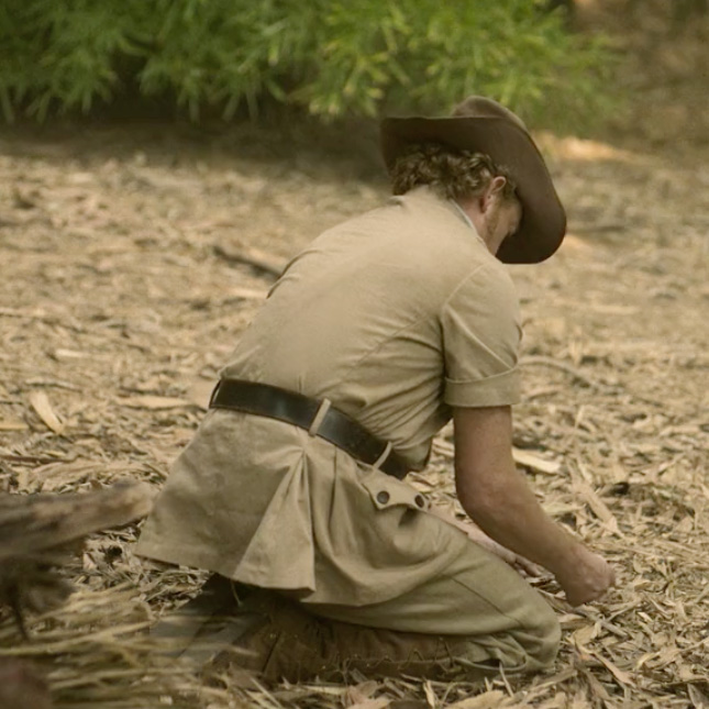
The back vents are sewn shut, but at least they’ve given him some little pleats. The belt worn around it may or may not be historically inspired, as some 18th century hunting/sporting waistcoats and jackets do have belts around them, but most of the ones I’ve seen are in a matching fabric. He pairs this delightful jacket with a slouch hat and some plus fours (I think? Maybe knickerbockers?). Both of which, to the best of my very limited knowledge, are more of a 20th or late 19th-century thing.

Gaiters are a perfectly appropriate 18th-century way to keep rocks and bugs out of your shoes while out in the wilderness! Though these ones have lacing down the sides instead of buttons.
A very good episode for costumes. Strictly speaking, Stede’s hiking clothes are about the same amount of historically inaccurate as his dreadful episode 5 party suit, but it’s done in a completely different way, and I feel it works so so much better here.
In episode 8, Ed’s rowdy ex, Calico Jack (Will Arnett), shows up and tries to ruin everything, and Frenchie and Wee John do some redecorating. Jack is the worst and I hate him. Thankfully he’s only in this one episode. He looks a bit like an extra from a cowboy movie. Let’s ignore him.

I love Stede’s purple velvet sleep mask. It’s hilariously inaccurate and absolutely perfect.

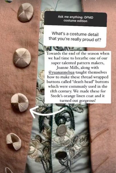
He wears a light brownish linen suit in this episode, and I was very happy to see that the coat has death’s head buttons! They were quite popular in the 18th century, but not something you see a lot of on film, so it’s always exciting when they show up on a costume.
They’re made by wrapping threads around a mould (I have a video tutorial if you want to try it) and are easy to spot from the way the threads shine in that little hourglass shape.


According to one of the costumer’s Instagram stories, this suit was made later in filming when they had a bit more time to make stuff and were able to add some more details. I’m very glad they did!
The pocket flaps are also at the same level as the buttons on the back, just as they should be, and I like the detail of the functional buttonhole in the pocket flap to help keep the pocket closed.

The waistcoat is a good length for the coat, hooray! They both look late 1760s-early 70s-ish.

On the less positive side, the breeches are way too loose, and the coat has an especially bad case of Modern Shoulders. On modern jackets, the sleeve heads are cut a bit bigger than the armhole and eased in around the top, and the seam allowances are pressed outwards into the sleeve, making them puff out a little bit.
On 18th-century ones, the sleeve heads are cut to the same size as the armholes, and the seam allowances usually pressed in towards the body, so you get a very smooth narrow shoulder. A lot of Stede’s other coats are actually pretty decent in this regard, so I don’t know why this one is so different. It’s a fairly small thing, but I can never unsee it.

This neckcloth isn’t bad and is much better than a lot of his other neckwear. It doesn’t go at all with the 1770-ness of the suit, but is fairly similar to early 18th-century ones. Those would either be made of lace all the way up to the point where it ties or just be plain cloth with a little fringed edge.

If you don’t like spoilers and haven’t seen the show yet, I suggest watching it before finishing this post, because I can’t really talk about the clothes in episodes 9 and 10 without mentioning some major plot points.
At the end of episode 8, Stede changes back into that strange disjointed blue suit from episode 1, which I’ve already talked about, but this time he’s wearing it with a different waistcoat. It’s still weirdly short, especially for the style of pocket flaps and the shape of the neckline and such, but I think it goes much better with the coat than the episode 1 waistcoat.

The gap in the neck cloth confuses me a lot. I don’t know why it’s there. It appears to be a matelassé fabric, in a not at all 18th century but very lovely brown and blue paisley pattern.

His shirt fabric looks a bit weird here compared to most of his other ones. I don’t know what it is, but I don’t think it’s linen. Usually you’d just have buttonholes on one edge of the waistcoat, but there are exceptions.
The end scene is a masterpiece in which everyone gets arrested in slow motion by the English navy, and I hope everyone reading this knows that the foot touch was improvised.
Episode 9 picks up shortly after the end of 8, so Stede is still wearing the same outfit, but without the coat and a bit more dishevelled.
The crew of The Revenge seem to just get released, but Ed and Stede agree to serve 10 years in the navy in exchange for pardon for their crimes. (By the way, I know I haven’t even mentioned the Badminton brothers in either of these posts, but I’m afraid I have no interest in anything military, sorry!)
In the barracks, they’ve changed into simple off-white shirts with plain brownish grey cotton breeches that I think are meant to be a bit reminiscent of modern military clothes. They look like they’ve got some gathers under the knee, which is rather strange. You want a nice smooth fit on the knee with 18th-century breeches.

These are the outfits they’re wearing in the kissing scene on the beach. Though there is a lot of very silly stuff in this show, the romance is played completely seriously, and this scene was filmed on a closed set.

I see an underarm gusset on Ed’s shirt! The shirts are pretty similar to most of the other ones in the show, being mostly good 18th-century ones but with the weird little button placket. They also have pleats at the wrist instead of the historically accurate gathers, which is decidedly odd. But I must once again compliment the nice narrow width of the wristbands!

When Ed stands up, you can see that his breeches have a proper adjustable 18th-century waistband with lacing at the back and gathers.
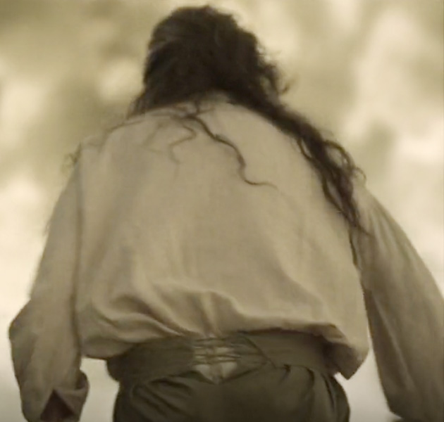
Good! This is what breeches look like from the back, and it’s one of those things that looks weird to modern eyes, so it’s wonderful when designers don’t shy away from it!

Some plans go awry, and Stede has a rather traumatizing night and walks barefoot back to his old house.
Episode 10 starts from Mary Bonnet’s perspective. Remember back in episode 4 when we saw flashbacks to Stede’s arranged marriage and how he abandoned his wife? Now we finally get to meet her! He’s a bit of a jerk for a good portion of this episode, and she gets to tell him off, and they amicably resolve the whole marriage thing in a very satisfying way.
Stede has two different but similar blue suits in this episode, first of which is this one.

It’s very similar to another, different one he wore at the start of episode 5, which I didn’t mention. Also fairly similar to this one from the V&A. Ehhh, it’s alright I guess. The pocket flap is a bit too low, and the front edges a bit too straight and narrow, but I like the colour and the trim.
I love the shirt he wears with it! It’s one of his very best! Look at that narrow wristband and nice fine ruffle, which is a good and sensible width with a lovely narrow hem.

Later he wears a suit in the same colour, but with different trim and a slightly different cut. I really like the collar, and I think in this screencap of just the top part it looks great! I’m also not going to complain about the waistcoat being buttoned all the way up this time, because it works with the way he’s feeling here.

The full view of the suit shows a nice 1770s-looking waistcoat, great big 1710s coat cuffs, and disappointingly narrow and straight-edged fronts. I know I’ve whined about straight and narrow coat fronts several times already, but it’s one of those little things that bugs me, and it’s so so common in film costumes. So many coats that ought to be cut wide at the top with a nice curved front are instead cut straight down in a line that just kinda skims over the nipples.
Again, just like the waistcoat length, my objection to this isn’t about the historical accuracy so much as the fact that the proportions and silhouette don’t look as good this way. (I realize I am very biased, and maybe some people prefer the nipple-skimming coats, but if they do they’re wrong.) I find it so strange that they have some coats that are cut really well next to ones that are cut like this! Maybe multiple different people did the pattern drafting? I don’t know.

The colours and the little collar make it vaguely reminiscent of this.

(And yeah that one has somewhat straight edges too, as coats tend to in the first couple decades of the century, but please observe that it’s still wide enough to be buttoned closed at the top.)
But the shape of the collar and the fact that it’s contrasting, as well as the aforementioned short waistcoat, are much more 1770s-80s. There are quite a few nice examples of contrasting collars from that time.

The cook at the art show has a nice apron!
These ones with the point at the top that button onto your coat or waistcoat were in use for a very long time, and it’s always great to spot one on screen.

I also like Stede’s nightgown, which looks like it’s made in the same way as most of his shirts, just longer.

And has what appear to be three cute little passementerie ball buttons on the collar.

This scene is so good.
With the help of Mary and her new boyfriend Doug (Tim Heidecker), Stede fakes his death in the most ridiculous and theatrical way possible. I really like the cream-coloured waistcoat worn by one of the guys he paid to hoist up the piano.

It’s a very good mid-century shape, and I also appreciate the abundance of decent shoes, stockings, and hats! So many people are wearing hats, hooray!
A lot of the shocked eyewitnesses have those narrow straight coat fronts, but they’re mostly extras with very little screen time, so I don’t mind it quite as much.
Ed, having returned to The Revenge alone at the end of episode 9, is wearing the pink velvet robe, being sad, and eating a lot of marmalade. In happier news, Oluwande and Jim are officially a couple now!

The last outfit we see Stede in is a plain and simple one, with black breeches, a very wide leather belt, and a somewhat less historical shirt. It’s got wider cuffs, a yoke, and a useless bit of renfaire lacing at the front. There’s a brief glimpse of a waist sash as he hauls his dinghy out to sea, and it also looks like he’s wearing boots with wide tops.

I’m not overly fond of this outfit, but it’s decent enough for travelling, and I’m sure he’ll be back in more fancy things as soon as he’s able.

Back on the ship, Ed has had a tragic and evil makeover montage and is currently back in his old outfit, but now with full gloves instead of fingerless ones.

But he’s still wearing Stede’s black cravat, which he kept after they swapped clothes in episode 4.
Final thoughts: Generally speaking, and making allowances for time and budget limitations, I like the costumes. Which is very surprising, considering they fill almost every single space on my bad 18th-century men’s costume bingo card! Overall, I think most of the designs work well for the show and are a good mix of historical and modern.
You can tell they did a lot of research from all the little historical details they included, even on things that weren’t trying to be historically accurate at all (like the fall closure on Ed’s leather pants), and I really appreciate that. Especially since, as far as I can tell, this is the first and only historical thing on Christine Wada’s list of costume designer credits.
There are a few pieces I find jarringly out of place, like Stede’s party suit, the blue episode 1 suit, the white one with the big collar, and especially the shirt that Spanish Jackie is wearing when we first meet her. (That shirt was in one of the first screenshots I saw, and had me fully expecting to hate the costumes.) But I’m aware that this is a “me” problem and that most people don’t have trouble suspending their disbelief for waist seams or circular cut ruffles.
The T-shirts and modern hair don’t bother me at all. Stede’s crew has a pretty good and coherent aesthetic, and Blackbeard’s crew has a totally different and also good and coherent aesthetic. In some ways the show feels a bit like a stage play, which makes the weird costumes seem less out of place.
I was also impressed by the sheer volume of costumes, holy heck they made a lot of clothes! They could have easily put Jackie and Geraldo in the same costumes every time they showed up, and given Mary only two or three dresses, but they all got different outfits in nearly every scene! I didn’t cover anywhere near all the costumes that appear on screen, and even skipped over quite a few of Stede’s suits.
(Oh! I don’t know where else to put this, but I’ve seen some comments from people talking about wanting to learn more about making 18th-century menswear, so here’s a link to my resources post on that. It’s a bit disorganized, and I keep meaning to write it up properly on my Blogspot, but haven’t gotten around to it yet.)
I find it strange and unfortunate that most of Stede’s waistcoats were later styles than the coats he wore them with and therefore too short. Not for historical accuracy reasons, just because the proportions look much better when the whole suit is from the same decade. However, I am glad that some of the coats in the show have nice curved front edges and that a lot of them avoided Moden Shoulders.
A big thing I am very happy about is that they didn’t try to make any of the 18th-century suits more “manly” by modern standards. Not one!! Everybody gets stockings, and lots of guys wear lace and ruffles and pretty colours!
Even scruffy art teacher Doug in his plain brown outfit has stockings. There are many many shoes and stockings and hardly any riding boots at all, which is amazing. Stripping away all the fun bits of 18th-century fashion to make it conform to modern gender ideals is annoying in any screen costume, but it’s especially important to not do that in a show about queer masculinity, and I’m so so glad they didn’t!
In a world of so many historical shows with drab unshaven grease-mop heroes, it’s wonderful to have a romantic lead who would happily wear this.

I do wish there’d been more early 18th-century fashion though. I love mid- to late-century suits as much as anyone, but I love the early ones too! Especially the 1720s and 30s, with their enormous curved cuffs and very full coat skirts. Early 18th-century fashion is so underrepresented, both in film and in the costuming community and has a much more piratey feel to it. Imagine how cool Spanish Jackie would look in something like this!

Costumes aside, I love this show, and now that we finally have news of a season 2 renewal I’m very excited to see what happens next! Will Frenchie and Jim be wearing leather like the rest of Blackbeard’s crew? Will we get more passementerie buttons? Will there be new and different wrapping gowns?? I really hope the deadlines for the costuming workshops are less tight this time around.
We’ve got quite a while to wait, but hopefully I’ll get to have more Opinions on costumes sometime next year! And, more importantly, will get to see all the characters reunited.
What do you think of the costumes in Our Flag Means Death?


_by_Studio_of_Johann_Zoffany_.jpg)
Is the fuchsia robe a banyan?
I believe it’s a wrapping gown, not a banyan. (To be fair, I hadn’t heard of either before I started watching this show, but some internet research I’ve seen suggests that a banyan is slightly more fitted, while a wrapping gown is looser and less formal.
I am overwhelmed with lust–I mean, for the garments. I want to watch this show. And I’m going to London in September (assuming nothing gets cancelled, including me), and can see some of these items at the V&A!
Was anyone else surprised in the best way when they actually paired Stede and Ed? I honestly didn’t think they would commit to it, and then the second was so lovely.
Also, I love the way they handled Mary and the kids, who, even if it was arranged and there was no romantic love there, they don’t act as though his family didn’t have the right to be angry he abandoned them, and in the end they let each other be happy.
I wondered about the metal moths on Ed’s leather shoulder piece. Not because it seems historically accurate (I’m no expert on such things) but just to ask what you make of them, and are moths significant to pirates or anything else, fashion wise? I really like them. Also I really like Stede’s final, plain outfit, again not because of accuracy but because it symbolises the change in him, and promises a future toughening up, just as Ed’s various outfits highlight his emotional journey.